Luxe with Dulux - Colour Selection
Deciding on the paint colour of a home is something I look forward to in every renovation, I have done some pretty bold things with colour in my short interior design lifetime, orange and “bumblebee” coloured curtains or emerald green, midnight blue and yellow walls! This blog I’ll take you through some of my processes in deciding on a neutral wall colour, for more about colour scheming for a whole house go to “Colour Your World”.
There are several things I considered while making my selections for this project; I wanted a neutral palette to appeal to a wide range of potential home buyers and a colour that would compliment the colours we had already decided on - the flooring colour and cabinetry for the kitchen, laundry and bathroom. You could spend some serious hours with colour samples, so I found my top pick neutral colours that have become my default colour choices that haven’t disappointed.
W H I T E Before my colour selection for The Block NZ, I had steered clear of using white. White has the potential to make a house feel like a hospital. All white interiors are definitely a strong and timeless design trend, and done the right way, it can look incredible. The discovery I made on The Block when I tried my hand at white walls was that Dulux provide colour schemes for every colour in their range. Meaning the colour you select, you are given two complimentary colours that will work alongside it. This colour scheming can be found on the back of every sample colour card in your local paint store or on their colour selection within their website. My tendency toward colour ended up leading me to my top pick whites. I decided on orange, Evans Bay and black, Taihape as feature colours and both colours had two whites that complimented them, Okarito (that I use for walls) and Hakataramea (that I use for trims and ceiling)

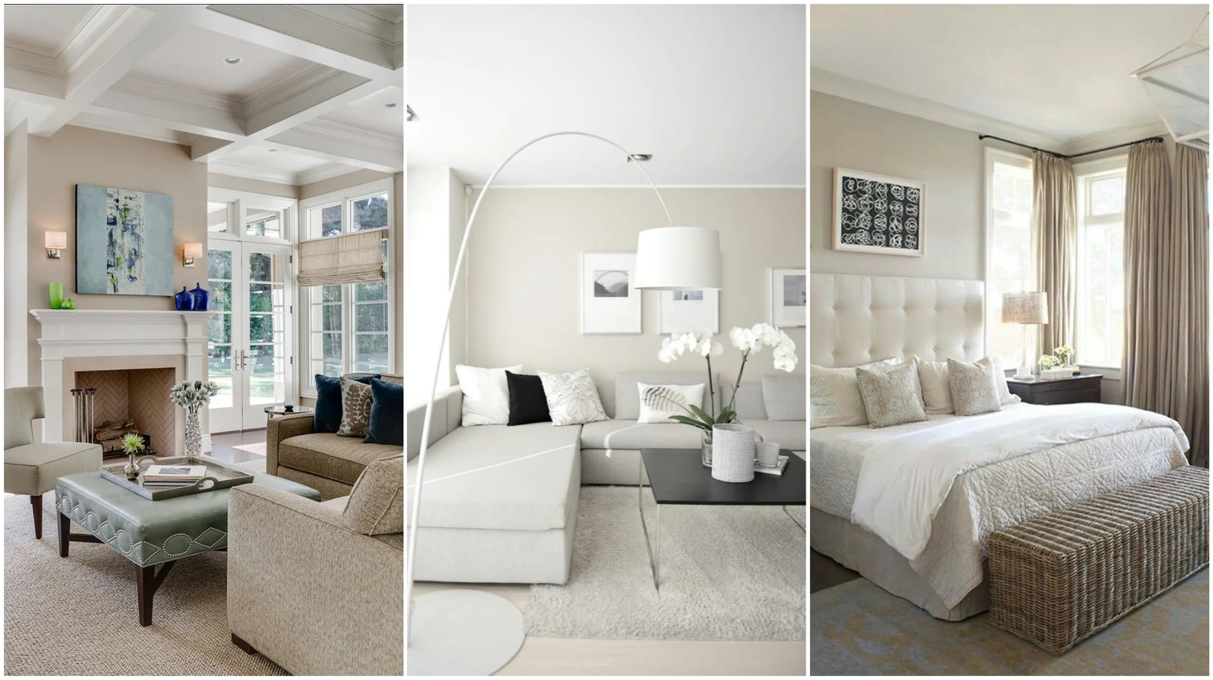
B E I G E When we did our first renovation, I decided on the paint colour everyone seemed to be using at the time “Quarter Tea”, it was the common interior colour – a light beige. There is a reason this colour works well, it’s warm, it compliments other colours and textures and is adaptable to a variety of interior styles. There are some homes, like the one we have lived in the past 3 years, that need the warmth and depth of beige on the walls, where other colours can look sterile and harsh. The popularity of beige also provides the benefit of keeping your cost down. A popular colour means there will be plenty of tiles, carpet and curtains in matching tones, and standard items are better priced. My top pick colours in the beige are Mason Bay and Sandrock Bluff.
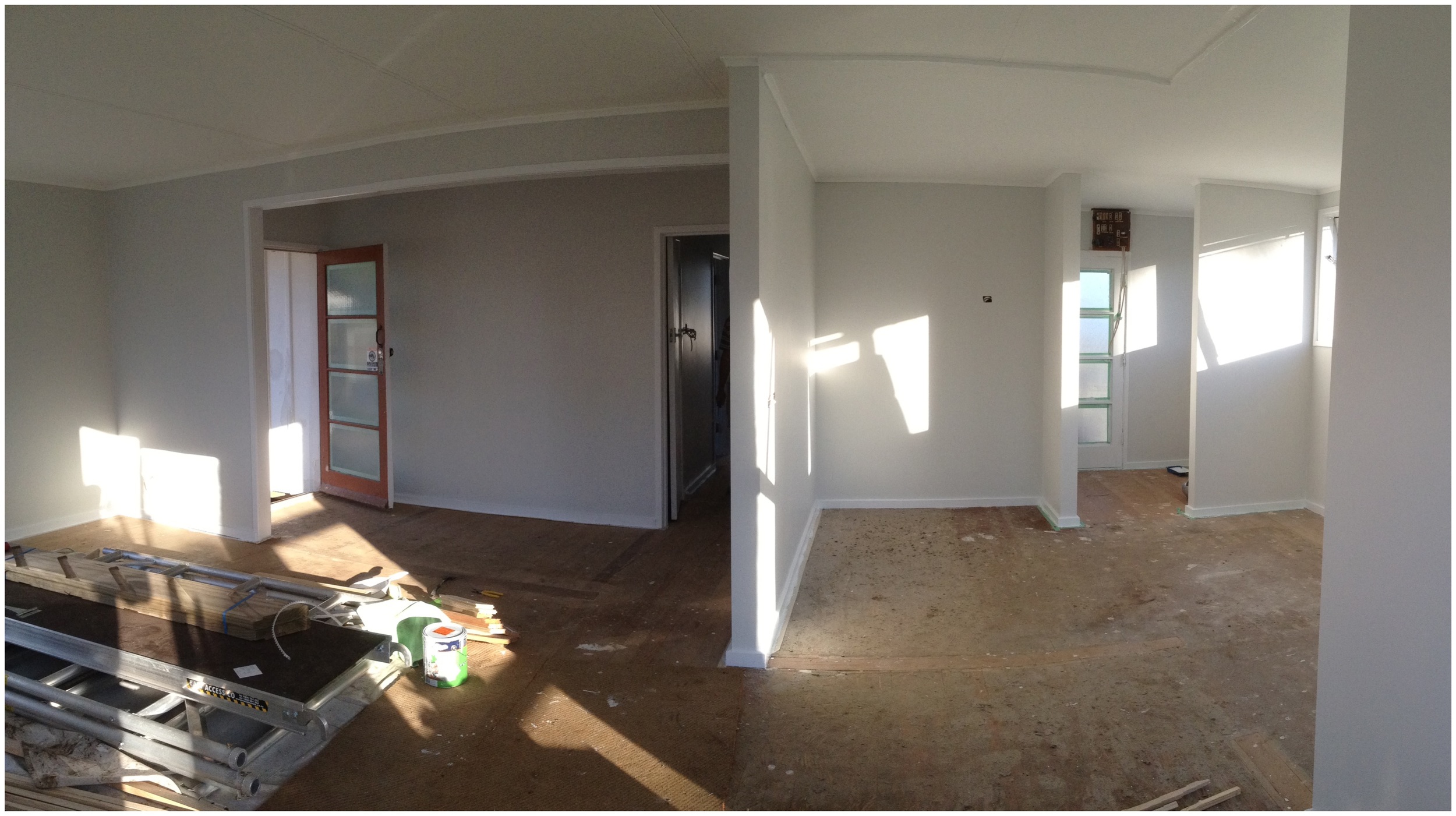
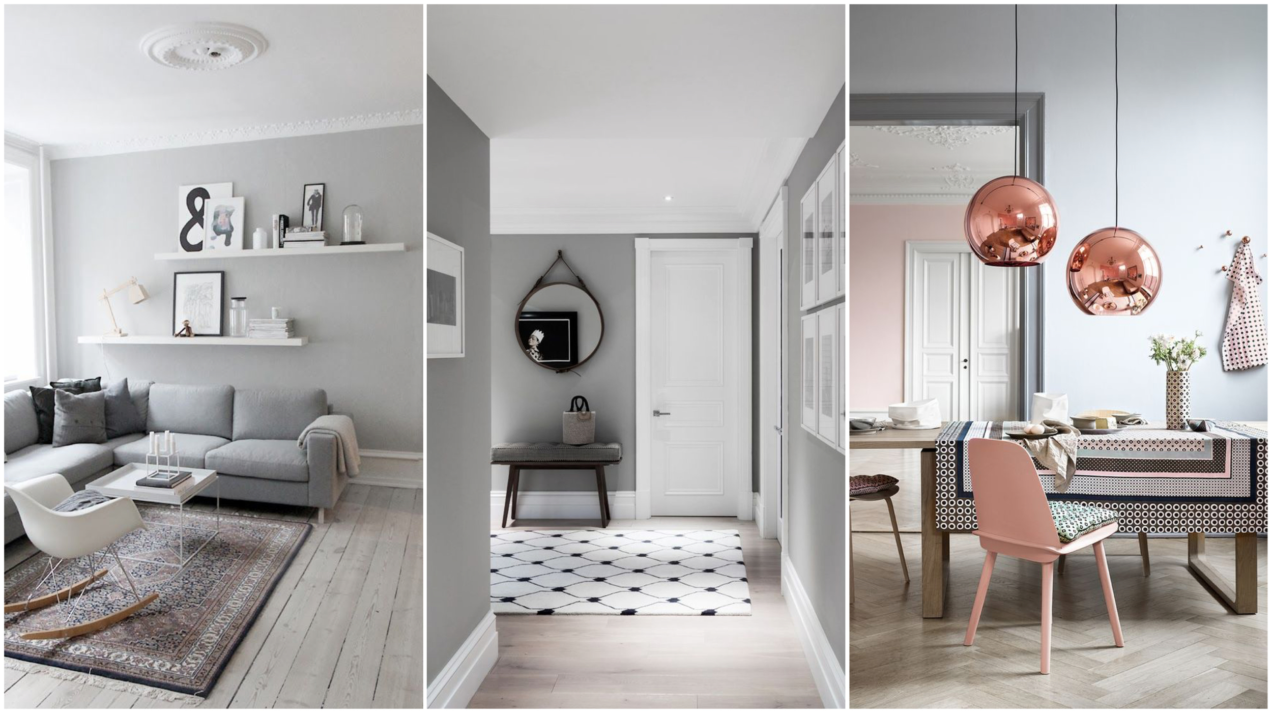
G R E Y It does seem the new beige of interior colours is grey. Grey creates an instant modern look within a home; it’s sharp and strong. Grey is all about how you work with the colour to draw out it’s warmth, as you do run the risk of it making a room feel colder and smaller. Grey needs to be matched well, about 10 years ago I redecorated my room with a beautiful textured black wallpapered feature wall and grey walls, the only problem was as soon as it went on the walls it looked blue not grey. Other colours in the room are going to affect how the grey looks – therefore don’t trust how it looks in the paint store – you need to test it on your own walls. I have found a grey that is warm and adaptable, I have used it for kitchen cabinetry, a study, and exterior colour and decided to use it throughout the whole house of our “Hidden Treasure” renovation. For this project I used Lyttleton Quarter for all of the walls in the hall, bathroom and living spaces. In the bedroom I went a tone darker with Lyttleton Half and for the exterior I used Lyttleton Double. I also had the kitchen splashback made to colour match Lyttleton.
There is something very satisfying about a new paint job and with a house as run down as our Hidden Treasure project, the first coat of paint is that glimmer of hope that this house could be something special. It is the fresh start of turning what was old into something new.